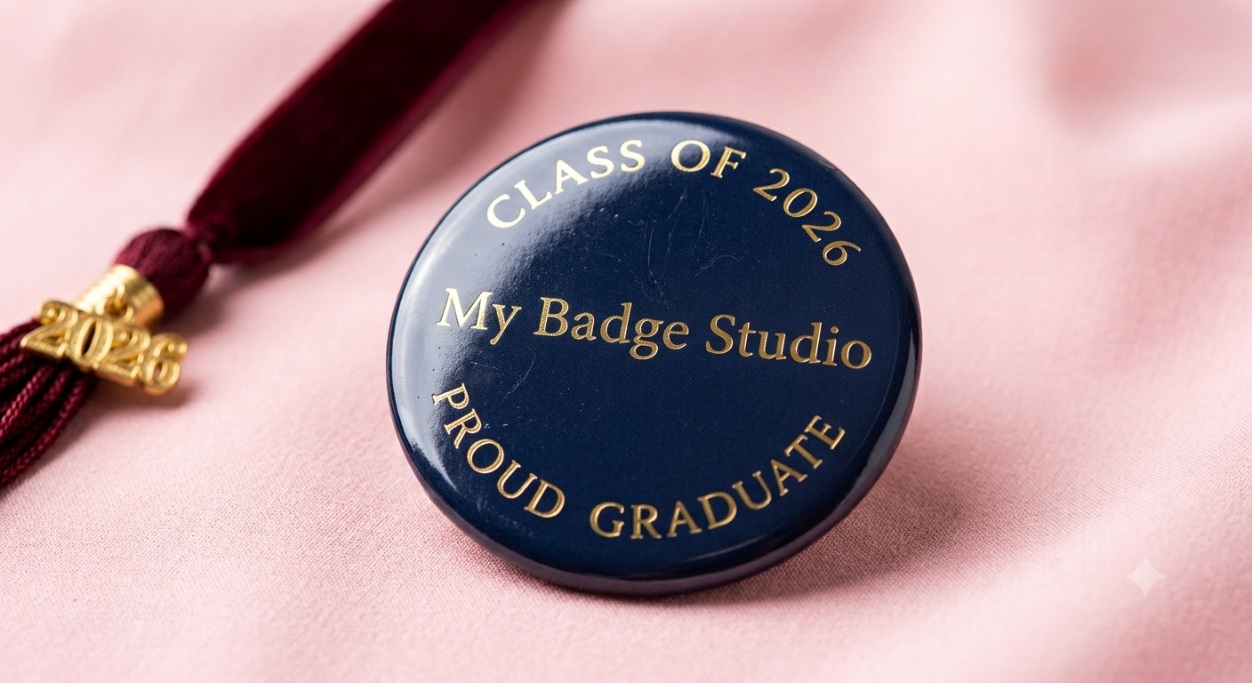
The most recognisable badge layout in the world is text curved around the rim — "CLASS OF 2026" arcing over the top, a name across the middle, "PROUD GRADUATE" cupped along the bottom. My Badge Studio has curved text built into the editor, so you can create that exact look on any button badge or fridge magnet in a few taps — no design software needed.
How to curve text (step by step)
- Open your badge. In the Template Studio, upload a photo or start a blank badge, hover it and click ✏️ Edit.
- Go to the Text tab and add your text (or select an existing line).
- Find the Curve control. Drag the slider — or tap the + / − buttons for precise one-step changes.
- Positive curve arcs over the top of an invisible circle (a "cap"); negative curve cups under the bottom. Around ±40 gives the classic rim-hugging look on a 58mm badge.
- Position it. Drag the text up toward the rim for a top arc, or down for a bottom arc. Adjust size and colour as usual.
The curve renders as true vector text, so it stays razor-sharp in the preview, the 3D mockup and the printed PDF.
The golden rule: longer text needs a gentler curve
The curve value bends your text around a circle whose size depends on how long the text is. A short word on a strong curve wraps into a tight loop; a long phrase on the same curve climbs steeply up the sides. So: short text → stronger curve, long text → gentler curve.
- 10–15 characters (e.g. "PROUD GRADUATE") — curve around −38 to −40 hugs the bottom rim beautifully.
- 20–25 characters (e.g. "THANK YOU FOR CELEBRATING") — soften to around −30 so the ends don't climb into your centre text.
- Under ~8 characters (e.g. "2026") — keep it straight; short text curls too tightly to read well.
Classic curved-text layouts
- Graduation: "CLASS OF 2026" arced on top (+40), the student's name straight in the middle, "PROUD GRADUATE" cupped below (−40).
- Birthday: "HAPPY BIRTHDAY" over the top, the name in a fun script in the centre, "LET'S PARTY" underneath.
- Weddings & favours: the couple's names in the middle with "THANK YOU FOR CELEBRATING" curved along the bottom.
- Sports & clubs: team name on top, player name and number in the middle, season below.
Shortcut: the Ready Designs gallery has finished badges with these exact layouts already tuned — open one and just swap in your name.
Tips for perfect arcs
- Mirror the values. If your top arc is +43, a bottom arc around −39 at the same distance from the rim looks balanced.
- Stay inside the safe zone. Keep curved text inside the inner guide circle so nothing is trimmed when the badge is pressed.
- Uppercase reads best on a curve. Script fonts curve too, but bold capitals stay most legible at small sizes.
- Pair with stickers. A sticker centrepiece between a top and bottom arc is the fastest professional layout there is.
Open the studio, add a line of text, and drag the curve slider — you'll have a rim-hugging arc in under a minute. Free to try, no credit card needed.
Frequently Asked Questions
How do I curve text on a button badge?
Open your badge in the My Badge Studio editor, go to the Text tab, select your text and drag the Curve slider (or use the +/− buttons). Positive values arc the text over the top; negative values cup it along the bottom. Around ±40 gives the classic rim look on a 58mm badge.
Why does my curved text overlap other elements?
Longer text on a strong curve rises steeply at the ends. Use a gentler curve for long phrases (around −30 for 20+ characters) and keep strong curves (±40) for short lines of 10–15 characters. Text under about 8 characters is better left straight.
Will curved text print sharply?
Yes. Curved text is rendered as vector type along a mathematical arc, so it stays perfectly crisp in the preview, the 3D mockup and the final 300 DPI print or PDF at any badge size.
Is curved text free to use?
Yes — curved text is available to every account, including the free plan. Free downloads carry a small mybadgestudio.com label; any paid plan removes it, or you can buy a pack of clean downloads.